
When someone lands on your website, they are not reading it word for word. They are scanning it. Heat mapping and eye tracking studies show that people follow predictable visual patterns when they look at a web page, often without realizing it. Professional web designers know how the eye moves and design with that in mind. When information appears where visitors expect it, everything feels easier to understand and the next step feels natural.
The Top Left Is the Anchor Point
On most websites, the logo lives in the top-left corner, and heat-mapping consistently shows that this is where the eye starts. Visitors instinctively look here first to confirm where they are. This happens almost automatically, before they read any text or start scrolling.
This moment is about reassurance. The logo helps the brain answer a quick internal check: Am I in the right place? If someone has seen or heard of your business before, this is where recognition happens, and trust begins to form. Even if the brand is new to them, the placement itself feels familiar. Years of repeated web patterns have trained users to expect identity and navigation cues in this location.
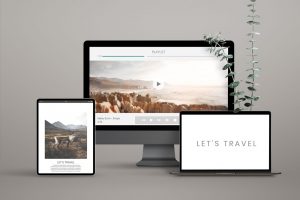
The Hero Section Is Where Meaning Is Established
The hero section is the top portion of your website that appears before someone scrolls. After the logo, the eye moves directly into this area. This is where visitors decide whether they connect with the website’s idea, product, or service. In just a few words, the hero should explain what you do and who it is for. It should include relevant keywords and location when applicable.
A clear call to action must be present, so visitors know what to do next. When that step feels obvious and supportive, moving forward feels natural rather than forced. Visitors gain instant clarity, and search engines gain context about your business and services.
Horizontal Scanning Is Where Understanding Deepens
After the hero section, the eye naturally scans horizontally across the page. This is where visitors begin looking for confirmation that you can actually help them.
This horizontal scan is the ideal place to introduce your services or products. Clear service blocks, short descriptions, and supporting visuals help visitors quickly understand what you offer without reading everything in detail.
When services are laid out horizontally, the eye can compare, process, and decide more easily. This helps guide visitors toward the option that feels most relevant to them.
Visual Anchors That Signal Action
After visitors orient themselves, understand what’s being offered, and scan services or key content, eye-tracking studies show attention naturally shifts to interactive elements. These include buttons, links, forms, and anything that visually suggests action.
Research consistently shows that people are drawn to elements that look clickable or actionable, especially after they’ve gathered enough context to decide what to do next.
This happens because the brain moves from information gathering to decision mode.
Additional Website Layout Tips
 Images Guide Attention
Images naturally pull the eye, especially photos of people. Eye tracking studies show that faces attract attention quickly, and viewers often follow the direction of a person’s gaze in an image. When images are placed intentionally, they help guide attention toward key messages or actions. When they are random or decorative, they can distract from what matters most.
 White Space Creates Flow
 White Space Creates Flow
Heat mapping also reveals that cluttered areas are often skipped. When too much information competes for attention, the eye moves away. White space gives the brain room to breathe and helps reduce decision fatigue caused by visual clutter. It allows the eye to rest, process information more easily, and move forward with less overwhelm. When spacing is intentional, visitors can focus, understand, and decide more comfortably.
Calls to Action Work Best Where the Eye Pauses
 Calls to Action Work Best Where the Eye Pauses
Visitors are most likely to notice and act on calls to action after they feel oriented and informed. Buttons perform best when placed after a clear benefit or explanation, where the eye naturally pauses. When calls to action appear at the right moment in the visual flow, they feel supportive rather than pushy.
People experience a website in a visual sequence. First orientation, then understanding, then exploration, then decision. When your site is designed to match how the eye naturally moves, visitors feel more comfortable, understand you faster, and are more likely to take action.
Good design works with human behavior, not against it.


